
On 25 February 1993, a 21-year-old working at a supercomputing center in Illinois posted a message to a mailing list proposing a new HTML tag.
He wanted a way to put a picture on a page. The tag would be called IMG, it would point at a file somewhere else, and the browser would fetch that file and draw it inline with the text.
The response was not enthusiastic. Other people on the list, including the man who had invented the web 4 years earlier, argued for something more general and more considered, a mechanism that could handle many kinds of media, that would negotiate formats properly, and that would not hard code a single narrow use case into the language forever.
Marc Andreessen shipped it in Mosaic anyway, and because Mosaic was the browser that everybody actually used, the argument was over before it finished. The IMG tag is still in every page you load today, still working roughly as proposed in that message, still unable to do most of what its critics wanted.
I open with this not because the tag matters technically but because of what it assumed. Until that moment the web was a system for moving documents between physicists, and nobody was designing anything, because there was nothing to look at and no reason to look. Afterward there was somebody looking.
Everything in the following 32 years was built on that assumption. Every layout technique, every trend, every argument about typography and color and performance rests on the premise that at the far end of the connection there is a person with eyes, deciding within a few seconds whether to stay.
That premise is now, for the first time, partially false, and this essay is about what that might mean.
I. What HTML was actually for
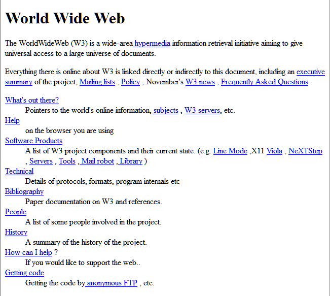
Tim Berners-Lee wrote the proposal in March 1989 at CERN, and his supervisor returned it with a note on the front reading vague but exciting, which is possibly the most consequential piece of managerial feedback ever given.
The problem was specific and unglamorous. CERN had thousands of physicists producing documents on incompatible systems, people arrived and left constantly, and information kept getting lost. What he built was a way to write a document, give it an address, and link it to another document.
The original HTML had a small number of tags, and almost every one describes what a piece of text is rather than how it should look. A heading, a paragraph, a list, an address, a block quotation, a citation. There is no tag for a column, no tag for a color, no tag for a position on a page, because those questions were not merely unanswered but considered out of scope. The author supplied structure and the reader's software decided presentation, since the same document might be read on a mainframe terminal or a workstation or printed out.
So the web's native format is an academic paper. Everything that follows is 3 decades of people trying to make an academic paper behave like a magazine, a television, a shop, and a machine.
II. 1994 to 1999. The magazine problem, and the 1 pixel that held the web together
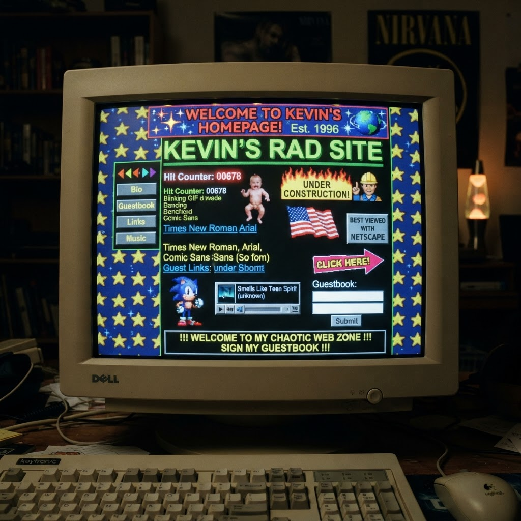
Once the web had pictures it got designers, and designers arrived from print, where you can put anything anywhere, and they immediately discovered that they could not put anything anywhere.
What they did instead is one of the great improvisations in the history of the discipline. HTML had tables, intended for tabular data such as experimental results. Designers began using tables purely for position, nesting them 4 and 5 deep, building entire layouts from a structure meant for spreadsheets. Then they took a 1 pixel transparent GIF, usually called spacer.gif, and stretched it to arbitrary widths and heights inside table cells to force spacing that the language provided no way to request.
David Siegel's Creating Killer Web Sites, published in 1996, taught this technique to a generation and sold enormously, and Siegel later expressed some regret about what he had unleashed. For roughly 8 years, a significant proportion of the visual web was held together by an invisible 1 pixel image, repeated millions of times, doing a job the medium refused to do properly.
The rest of the era follows from the same pressure. Whole designs were built in Photoshop and sliced into pieces, so that a page was really a jigsaw of images pretending to be a layout. Text became an image whenever a designer wanted a typeface, since the browser only had what the visitor had installed. Netscape shipped the FONT tag and the BLINK tag, the latter reportedly conceived during an evening at a bar and regretted almost immediately, and Microsoft answered with MARQUEE. Those 2 tags are the purest expression of an era in which presentation was being bolted onto a document format by commercial rivals with no plan.
And the palette was 216 colors, because 8 bit displays showed 256 and the operating systems reserved the rest, which is why the specific blues and greens of 1997 are so instantly recognizable. That was not a style. It was an inventory.
III. 1996 to 2010. Flash, or what happens when designers finally win
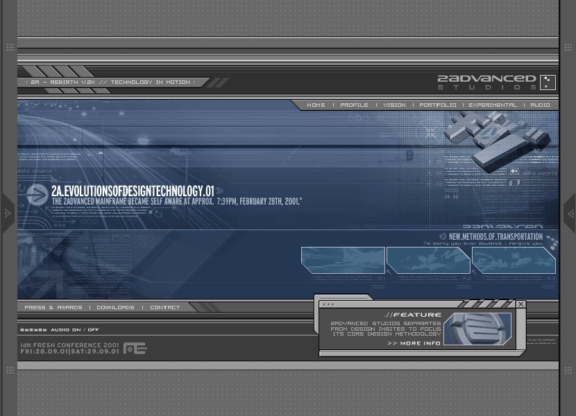
Macromedia acquired a small product called FutureSplash in 1996, renamed it Flash, and handed the web's designers the thing they had wanted since the IMG tag, which was a rectangle inside which they controlled every single pixel.
The consequences were immediate and, for several years, genuinely thrilling. Animation, sound, video, custom typography, physics, transitions, and whole interfaces that behaved like nothing that had existed before. Studios like 2Advanced built sites that felt like the control panel of a spacecraft. The technique of opening with a full screen animation became so universal that the words Skip Intro entered the language as a joke about the entire era.
It was also the most complete expression of building for human eyes and nothing else. Inside that rectangle there were no headings, no paragraphs, no links in any sense the web understood, and no addresses. You could not link to a page inside a Flash site, because there were no pages. The back button did nothing. Search engines saw a blank wall. Screen readers saw nothing at all, which made a large portion of the commercial web unavailable to blind users for most of a decade. Text could not be selected, copied, or translated.
Steve Jobs published Thoughts on Flash in April 2010, refusing to support it on the iPhone, and the document is worth reading as an argument rather than as corporate positioning, because the technical objections in it were mostly correct.
IV. 1998 to 2007. The standards movement, and the most persuasive demo ever built
While Flash was winning commercially, a small group of people argued that the web should be made to work as designed rather than escaped from.
The Web Standards Project formed in 1998 and spent years pressuring browser makers toward consistent implementation of CSS. Jeffrey Zeldman's Designing with Web Standards appeared in 2003. Doug Bowman rebuilt Wired's site on standards based markup in 2002, which mattered because it proved a major commercial property could do it.
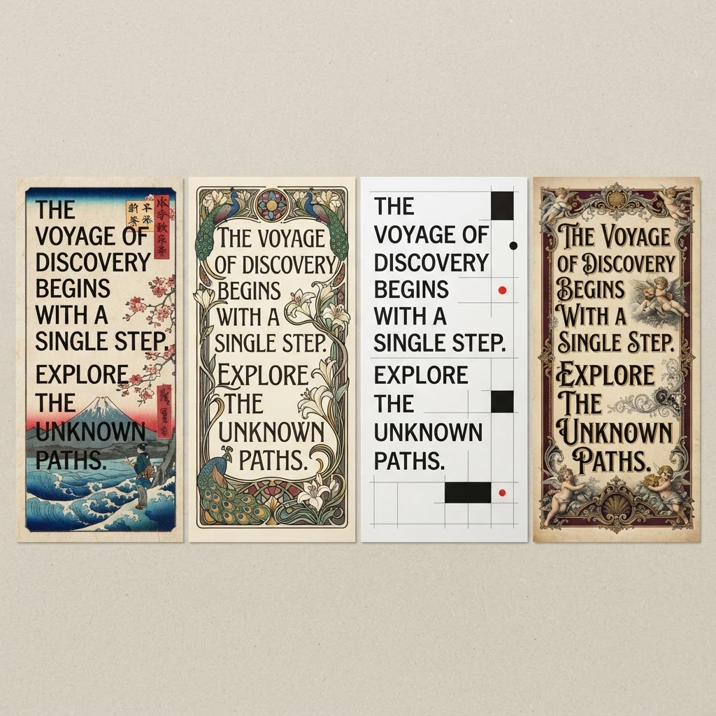
The single most effective artifact of the movement, and I would argue the most persuasive piece of design advocacy ever produced in any medium, was Dave Shea's CSS Zen Garden, launched in 2003. The idea was almost childishly simple. 1 HTML file, containing the same words in the same order, never changed. Hundreds of designers each submitted a stylesheet. The results ranged from Japanese woodblock to Art Nouveau to Swiss modernism, and none of them touched the content.
It settled an argument by demonstration rather than assertion, and it proved that everything the table layout era had done was now unnecessary.
V. 2004 to 2008. Gloss, gradients, and the page that never reloads

Gmail launched in 2004 and Google Maps in 2005, and both broke the reader's mental model of what a page was, because they changed without reloading. You dragged the map and more map appeared. Jesse James Garrett coined the term AJAX in an essay in February 2005 to describe the technique, and within 2 years every ambitious site was using it.
The visual language followed, as it always does. The glossy period arrived, with its vertical gradients and rounded corners and reflective badges and perpetual beta ribbons, and it arrived precisely when CSS support made gradients and rounded corners producible without cutting images in Photoshop. jQuery appeared in 2006 and made interaction cheap enough that everything acquired a fade.
VI. 2007 to 2013. The phone, which nobody had designed for
The iPhone shipped in 2007 with a real browser and no Flash, and the immediate effect was that millions of people began visiting sites built on the assumption of a mouse, a keyboard, and a screen roughly 1,000 pixels wide.

The first response was to build a second site, usually at an m dot address, which meant maintaining 2 of everything and dividing the web into a real version and a lesser one.
Ethan Marcotte published Responsive Web Design in A List Apart on 25 May 2010, arguing for fluid grids, flexible images, and media queries, so that 1 document reflowed to fit whatever was reading it. The argument won comprehensively within about 3 years.
Several received ideas died here. The fold, inherited from newspapers, stopped meaning anything when there was no fixed page height. Fixed pixel widths became nonsense. And flat design arrived, usually explained as a reaction of taste against skeuomorphic gloss, though the practical pressures were overwhelming, since flat vector elements scale to any resolution, weigh almost nothing, and can be specified in a system that 100 engineers can implement without exercising judgment.
VII. 2013 to 2022. The framework era, and the great sameness

React was released by Facebook in 2013, and over the following 5 years the single page application became the default way to build anything ambitious. The server sent an almost empty document containing 1 div, and JavaScript constructed everything else in the browser.
The design consequence arrived through a different door. Bootstrap, released by Twitter in 2011, gave everyone a grid, a navbar, a card, and a set of buttons, and it was excellent, and within 2 years an enormous portion of the web had visibly the same skeleton. Then the template marketplaces and the site builders did the same thing at larger scale for people who were not developers at all.
By roughly 2019 the commercial web had converged on a single structure so completely that you can describe it from memory. A full width hero with a short bold claim and 2 buttons, 1 filled and 1 outlined. A row of gray client logos underneath. 3 feature cards with small line icons. A testimonial with a circular headshot. A pricing table with the middle tier highlighted and labeled most popular. A final call to action band. A footer with 4 columns.
Nobody designed that page. It accreted, because it worked well enough, because each piece was available for free, and because the cost of deviating from it was higher than the cost of shipping it.
VIII. 2020 onward. The correction nobody enjoyed
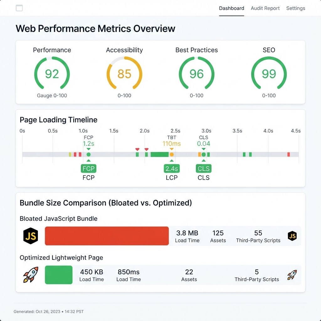
The correction came from performance, which is usually where corrections come from.
Sites had become enormous. Pages routinely shipped multiple megabytes of JavaScript to display an article of 900 words. On a mid range phone on an ordinary connection, a text article could take 5 seconds to become readable, and a meaningful proportion of visitors left before it did.
Google began incorporating Core Web Vitals into ranking in 2021, which converted a craft concern into a commercial one overnight. Static site generation returned. Server side rendering returned. Architectures appeared with names like islands, whose premise is that most of a page needs no JavaScript at all. React itself introduced server components. Somebody built HTMX, which began as something close to a joke about how far the industry had traveled and is now used seriously by a lot of people.
For 32 years, every one of these arguments had the same unexamined thing in common. All of them were arguments about what worked better for a person.
IX. What AI does to the making of websites
Two things are happening at once, and they are not the same thing, and most discussion collapses them.
The first is that building has become extraordinarily cheap. Describe a dashboard and receive a working one. A founder with no technical background can produce a functioning application in a weekend, and it will work, and it will look professional.
The visual consequence already has a signature that most people in this profession can identify within about 2 seconds. A particular neutral sans serif. Generously rounded corners. A soft 1 pixel border in light gray. Subtle shadows. A muted gradient in the hero. A dark mode toggle nobody asked for. A certain arrangement of card components that comes from the handful of component libraries that dominate the training data.
This is not a criticism of those libraries, which are genuinely excellent and solve real problems. It is an observation about what happens when the cheapest path is also the most common path. The convergence of 2019 took roughly 6 years to happen through Bootstrap and templates. The current one took about 18 months, and it is tighter.
Which means competence has become free, and distinctiveness has become scarce, and those are the same sentence said twice.
X. The twilight question
Now the part that I think matters more than any of the above, and that almost nobody was seriously discussing 3 years ago.
For 32 years the web has been built for a person with eyes, a pointing device, and a few seconds of patience. That is the assumption underneath every technique in this essay. It is the reason we argue about typography and hierarchy and load time and color, and it has never once needed defending.
It is now partially false, and the share of readers who are not people is rising rather than falling. Automated traffic has been a large fraction of all web traffic for years, and most of it was crawlers and scrapers and nuisances. What is new is that a substantial and growing portion of it is now reading on behalf of a specific person who asked a specific question somewhere else, and who will very likely never arrive.
This reader has properties that invert almost everything the profession knows. It does not scroll, so there is no fold and no sequence. It is unmoved by a hero animation, because it does not experience time passing. It does not see your typeface or your palette or the transition that took a week. It will not wait for JavaScript to assemble a page if it can avoid it. It cannot open the modal that hides your pricing, and it will report that you do not publish pricing. It reads structure rather than composition. And it strongly prefers content that has an address, because something without a URL cannot be cited, and something that cannot be cited effectively does not exist to it.
So the honest question is not whether design is still worth doing. It is who the artifact is being made for, and there are 3 plausible answers, and I think it is worth laying them out without pretending to certainty.
Future prediction 1: the website becomes infrastructure
In this version the interface layer moves to assistants, and sites become the feedstock those assistants read. People stop visiting for information the way they stopped visiting for phone numbers. What a company publishes matters enormously and how it looks matters barely at all, because the last human eye in the chain is looking at something an assistant composed.
If this is right, then the craft of the web contracts to something closer to publishing and database design, and a great deal of the industry is currently decorating a warehouse.
I think this is clearly correct for one entire category of site, being the ones whose function is to answer a factual question. Store hours, specifications, shipping policies, documentation, FAQ pages, comparison tables. That material is being disintermediated right now, and no amount of design will prevent it, and honestly it was never a good use of a person's attention.
Future prediction 2: the web splits into 2 artifacts
In this version every organization ends up maintaining 2 things that look nothing alike.
There is a machine surface, which is plain, structured, server rendered, exhaustively factual, addressable at every level, and designed to be quoted accurately by something that will never show your logo. And there is a human surface, which is a destination, and which has to justify a deliberate decision to go somewhere.
I think this is the most likely outcome, and the interesting thing about it is that almost every company is already building the first one by accident and badly. Nobody has an owner for it. It is nobody's job, it is measured by nobody, and it is currently produced as a side effect of a content management system that was chosen for other reasons.
Future prediction 3: the human web becomes a smaller and much more valuable place
This is the one I would bet on in combination with the second, and the case for it is historical.
Every medium that was declared dead by a newer one survived by becoming what the newer one could not be. Radio did not die from television, it became portable and local and live. Cinema did not die from television, it got physically larger and more spectacular, because once you could watch a story at home the theater had to justify the trip. Theater did not die from cinema. Printed books did not die from screens, and the ones that sell now are frequently better made as objects than the ones that came before.
In each case the medium lost the function it had been performing by default and kept the function it performed uniquely, and the thing it kept turned out to be worth more per encounter than what it lost.
Apply that here. What a website loses is the job of being a place you go to look something up, which it never did particularly well and which it only did because there was nowhere better. What remains is the thing an assistant structurally cannot deliver, which is the experience of having been somewhere made by someone.
A summary of a company can tell you what it claims. It cannot transfer the specific impression of care and competence and seriousness that comes from arriving somewhere well made, which is a judgment people form in a few seconds and act on for years. That judgment is not an information problem, and it is not solved by more facts, and it is the reason a badly built site loses business even when everything on it is true.
If fewer people visit, but the ones who do are arriving deliberately and at the point of deciding whether to trust you with money, then the value of what they encounter goes up rather than down. Fewer visits, each worth considerably more, which is the same trade that cinema made and vinyl made and printed books made.
XI. The strongest case against all of this
The objection I take most seriously is that the third future is a comfortable story invented by people whose livelihoods depend on it being true, which describes me, and I would rather say that plainly than have a reader think it.
The argument against goes roughly like this. The historical analogies flatter us, because radio and cinema and vinyl all survived at a small fraction of their former economic importance, and describing that as a victory is a choice of framing. If the assistant becomes where evaluation happens and not merely where retrieval happens, meaning people ask which supplier to trust and act on the answer, then the moment of judgment never involves your site at all and no amount of craft reaches it. Under that scenario the winners are whoever is described most favorably in the material these systems read, which is a reputation and public relations problem rather than a design problem.
I do not have a confident rebuttal, and I think anyone offering one is selling something. What I would say is that trust delegated to a machine is still trust in something, and that every intermediary in history has eventually been evaluated on the quality of what it recommended, and the material it is recommending has to be good or the intermediary stops being used. That is a slower and more indirect route from craft to consequence than we are used to, but it is not a severed one.
XII. Back to the tag
Andreessen's tag is 32 years old and has never been replaced.
He added it so that somebody could look at something, and everything in this essay grew from that premise. Tables and spacer GIFs, Flash and Skip Intro, the standards movement, the glossy period, responsive grids, the framework years, the great sameness, and the performance correction are all elaborate answers to the same question, which is what a person should see and how quickly they should see it.
For the first time, the premise underneath the question is genuinely uncertain, and I do not think anyone honestly knows how it resolves. What seems clear is that the part of this industry that existed to deliver information efficiently to a human being is being taken over by something better at it, and that the part that existed to make somebody feel they had arrived somewhere real is not.
If we are in a twilight, it is the twilight of the website as a lookup mechanism, and that thing was never the good part. What it might leave behind is a smaller web, visited on purpose, where the only reason to build something is that a person will be glad they went.
That would be a considerable loss of volume, and I am not certain it is a loss of anything else.
Lilu is a design studio working in brand, identity, and digital. If you are building something on the web and want it to be worth arriving at, we would like to hear from you.
Start a conversation