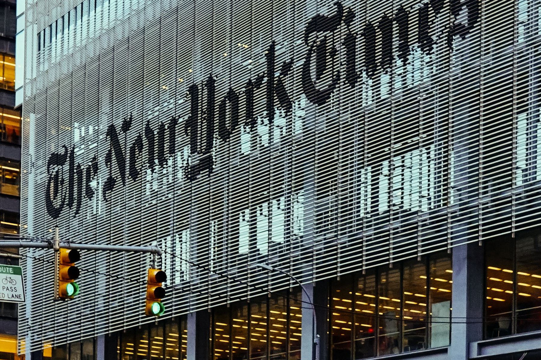
In 1966, the CBS Building opened on 6th Avenue, and in its cafeteria there was a wall roughly 35 feet long covered entirely in typography.
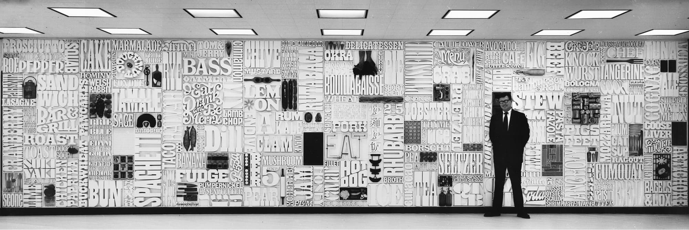
It was called the Gastrotypographicalassemblage, it was designed by Lou Dorfsman with Herb Lubalin's involvement, and it consisted of hundreds of hand cut wooden words and objects related to food, arranged in a composition of extraordinary density. Every letterform was made specifically for it. It is one of the great pieces of American graphic design, and it was built for a room where employees ate lunch.
During a renovation in the 1980s, somebody who did not know what it was had it taken down and put in a dumpster. It survived because a designer named Nick Fasciano heard what was happening and intervened, and after years in storage it was restored and now lives at the Center for Design Study in Georgia.
I start here because the wall contains the whole argument of this essay in a single object. A corporation once believed that the way its cafeteria was lettered mattered. It hired the best people alive to do it. And then, within 20 years, the institution that commissioned it had forgotten what it owned.
New York invented the idea that a company should have a designed identity. It then spent 70 years changing its mind about what that means, who makes it, and which neighborhood they make it in.
I. 1943 to 1956. Where corporate identity was invented
The phrase corporate identity is usually traced to Lippincott and Margulies, founded in New York in 1943, who built a business on the then novel proposition that a company's visual presentation was a strategic asset rather than a stationery problem.
The reason this happened here, and not in Chicago or London, is unglamorous and mostly about geography. In the 1950s, a very large share of American corporate headquarters sat within a few square miles of midtown Manhattan. The magazines were here. The television networks were here. The printers and engravers and typesetters were downtown. A designer could walk from a client's boardroom to a press check in 20 minutes, and that compression is what makes a discipline form.
William Golden designed the CBS Eye in 1951, and it has survived more than 70 years essentially unmodified, which almost no corporate mark does. The story told about it is that when Golden proposed replacing it the following season, Frank Stanton told him that just when you start to get bored with what you have done is probably when it is starting to sink in with the public, which remains the single best piece of advice in this profession.
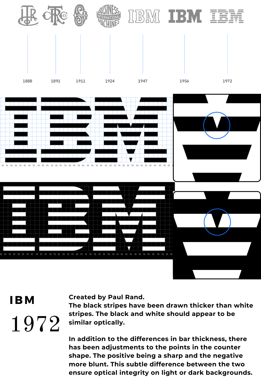
Paul Rand began working with IBM in 1956, and what he built there was not a logo but a system, meaning rules for how the company would appear across every possible surface, enforced by a manual. He was born Peretz Rosenbaum in Brooklyn and changed his name in part because he understood what an Anglicized byline would do for his prospects, which is itself a piece of branding and tells you something about the era.
II. 1957 to 1972. Midtown, and the run that defined everything after
Ivan Chermayeff and Tom Geismar founded their studio in 1957, and it is still operating today as Chermayeff and Geismar and Haviv, which makes it the single continuous thread running from the birth of this discipline to the present.
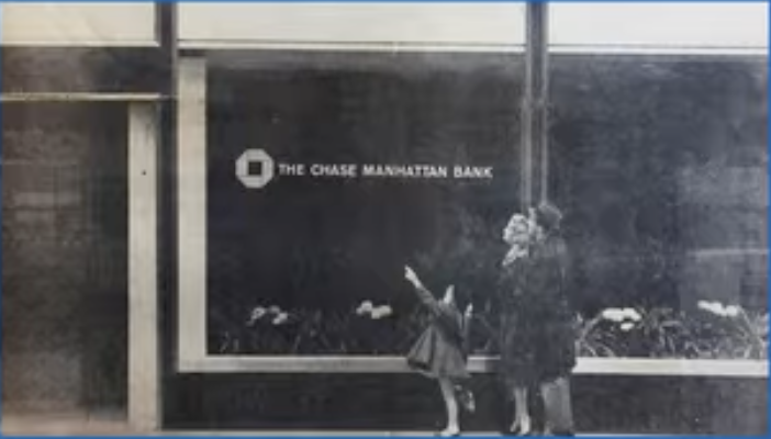
Their Chase Manhattan mark of 1960 is frequently described as the first entirely abstract corporate symbol adopted by a major American company, meaning it does not depict a bank, or a vault, or anything at all. It is 4 wedges around a void. Persuading a conservative institution to accept a shape that represents nothing is arguably a greater achievement than designing it.
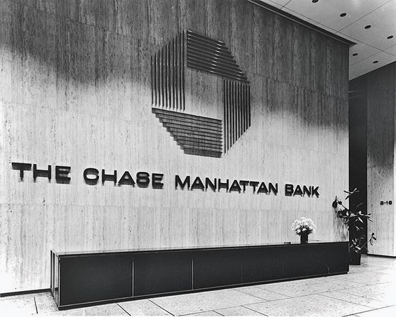
Then Mobil in 1964, developed with the architect Eliot Noyes, where the identity extended past the mark into the physical design of the service stations, which is one of the earliest examples of a brand being understood as an environment rather than an image.
Massimo Vignelli arrived from Milan in 1965. With Bob Noorda at Unimark he produced the New York subway signage standards in the late 1960s, a document that governs how you find your way underground to this day, and then the 1972 subway diagram, which abandoned geography in favor of legibility and caused an argument that has not ended. New Yorkers rejected it for being wrong about where things are. It now hangs in MoMA.
He also designed the American Airlines identity in 1967, which lasted until 2013, and he reportedly argued against the 2013 replacement in public, which is a very Vignelli way to end a client relationship.
III. 1969 to 1981. Downtown drifts, and branding becomes language
Siegel and Gale opened in 1969 and did something that looks small and was not.
In 1975 they worked with Citibank to rewrite its consumer loan note in plain English, replacing several hundred words of impenetrable legal construction with something a person could actually read. It was widely covered, it influenced plain language legislation, and it established that brand work includes how an institution talks, not only how it looks. Half of what a contemporary studio sells under the heading of voice descends from that document.
The geography was shifting at the same time. SoHo's 1971 artist in residence zoning legalized living in the cast iron loft buildings that manufacturing had abandoned, which created a downtown creative economy that design studios moved into over the following 2 decades. The work followed the rent, as it always does.
And in 1981 MTV launched with a logo from Manhattan Design, a 3 person studio, and the crucial decision was that the M would stay fixed while the surface inside it changed constantly. The identity was designed to be vandalized by its own owner. That is systems thinking roughly 25 years before the industry had a name for it, and it is the direct ancestor of every flexible identity a tech company has shipped since.
IV. 1978 to 2000s. Pentagram, and the studio as institution
Pentagram opened its New York office in 1978, and the structure is worth understanding because it is unusual. It has no CEO and no holding company above it. Each partner runs their own team and owns an equal share, and partners are expected to do the work rather than sell it, which is the opposite of how agencies normally scale.
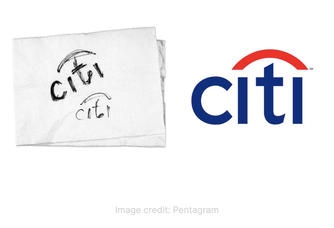
Paula Scher joined in 1991. Her identity for the Public Theater in the mid 1990s took the vernacular of street posters and wood type and made it the official language of a cultural institution, and it is probably the most imitated piece of American graphic design of that decade. Her Citi logo of 1998, where the arc of the t becomes a red umbrella inherited from Travelers, was reportedly sketched on a napkin in the first meeting, a story she has had to explain for 25 years because clients hear it as evidence that it was easy rather than as evidence of 20 years of preparation.
Stefan Sagmeister opened in New York in 1993 as the counterweight, making work that was handmade, uncomfortable, and often funny, and proving that a studio could build an international reputation while staying very small.
V. 1995 to 2001. Silicon Alley, and the first tech boom
The first time New York tried to marry technology and design at scale, it ended badly, and the reasons are worth understanding because they have not entirely changed.
Silicon Alley formed in the mid 1990s around the Flatiron district and 55 Broad Street, a vacated downtown office building rewired for internet companies. Razorfish, Agency.com, DoubleClick, iVillage, TheGlobe.com. At its peak the sector was a genuine rival to San Francisco, and the studios attached to it grew very fast on the premise that every company would need a website and somebody had to build them.
Then 2000 happened, and most of it disappeared within 18 months.
The useful lesson is not that the market corrected. It is what those shops had been selling. They scaled on volume, meaning headcount billed against production, and when the money stopped there was nothing underneath that a client valued enough to keep paying for. The firms that survived the decade were generally the ones selling judgment rather than output, which is the same distinction that matters now for an entirely new reason.
VI. 2000s to 2019. Across the river
The center of gravity crossed the East River, and the mechanism was rent.
DUMBO's conversion from industrial buildings into creative tenancy, largely under a single developer, produced a dense cluster of digital studios. Huge was founded in Brooklyn in 1999. Big Spaceship in 2000. Work and Co in 2013, built specifically around shipping product rather than producing decks.
Red Antler launched in 2007 and became the defining studio of the direct to consumer era, doing the early identity and launch work for Casper, Allbirds, Brandless, and Hinge. Whatever you think of that aesthetic, and a great deal of it now looks interchangeable, the model was new. These were brands designed before the product existed, for companies whose entire distribution was a phone screen.
COLLINS, led by Brian Collins, produced the 2015 Spotify identity with its duotone system, the 2017 Dropbox rebrand, and work for Mailchimp, and these are the clearest examples of the change in what the job had become. A 1960s identity had to survive on letterhead and a building. A 2015 identity has to survive on a product that ships a new version every Tuesday, across thousands of screen sizes, applied by people who will never speak to the designer.
VII. 2020 to now. What remote work did to the studio
Then everyone left.
The 2020 and 2021 out migration from New York City was substantial and disproportionately creative, and the Hudson Valley and the Catskills absorbed a great deal of it, to the point where house prices in towns 2 hours north moved in ways nobody had forecast. Designers, writers, photographers, and art directors who had been paying Brooklyn rent for proximity discovered that proximity had stopped being a service they were receiving.
The effect on studios was structural rather than cosmetic, and I think there are 3 consequences worth naming.
The address stopped being proof. For 70 years a studio's location was part of its pitch, because a Madison Avenue address, and then a SoHo loft, and then a DUMBO floor, each signaled a particular kind of seriousness to a particular kind of client. That signal is now close to worthless, since a client who has run their entire business over video calls for 5 years has no way to be impressed by a floor they will never visit. What is left as proof is the work, which is a healthier arrangement and a harder one.
The talent pool decoupled from the island. A studio operating in New York now draws from a radius of several hundred miles, and the practical result is that a very small team can assemble unusually senior people for specific projects without any of them relocating or appearing on a payroll. The small studio got structurally more competitive against the large one, because the main advantage of scale had been the ability to keep expensive people sitting in a room.
And something genuinely was lost, which I would rather concede than skip. The reason this discipline formed in midtown was compression, meaning that people in the same trade kept running into each other and arguing. Studios that went fully distributed often report that the work got more efficient and less surprising, and junior people in particular stopped absorbing the thousand small judgments that are transmitted by sitting near somebody rather than by being told. The industry has not solved this and mostly pretends it has.
VIII. Brands that were made in New York
A partial list, because the concentration is genuinely remarkable.
CBS Eye. William Golden, 1951. Essentially unchanged for over 70 years.
IBM. Paul Rand, from 1956, with the striped version arriving in 1972.
Westinghouse. Paul Rand, 1960.
UPS. Paul Rand, 1961. The shield with the parcel, used until 2003.
ABC. Paul Rand, 1962. 3 lowercase letters in a circle.
Chase Manhattan. Chermayeff and Geismar, 1960.
Mobil. Chermayeff and Geismar with Eliot Noyes, 1964.
American Airlines. Massimo Vignelli, 1967. In service until 2013.
New York City subway signage. Unimark, Vignelli and Noorda, late 1960s. The 1972 diagram followed.
Mastercard. The interlocking circles, 1968, from Lippincott and Margulies.
I Love New York. Milton Glaser, 1977, reportedly sketched in the back of a taxi and donated to the state for nothing.
MTV. Manhattan Design, 1981.
NBC peacock. The current simplified version, Chermayeff and Geismar, 1986.
The Public Theater. Paula Scher at Pentagram, mid 1990s.
Citi. Paula Scher at Pentagram, 1998.
Spotify. COLLINS, 2015.
Dropbox. COLLINS, 2017.
Casper, Allbirds, Hinge. Red Antler, 2014 onward.
And then the companies themselves, built here and carrying identities made here: Etsy, Kickstarter, Squarespace, Tumblr, Vimeo, Foursquare, Warby Parker, Oscar, Peloton, Harry's, Glossier.
IX. What this means if you are a tech company choosing a studio here
The honest version, including the parts that are not flattering.
What the New York lineage is actually good at is the thing it has been practicing since 1943, which is making an institution legible to strangers at scale. Every landmark above is an answer to the question of how something large and complicated can be recognized instantly and consistently by people who will never be told the reasoning. That is a specific skill, it took 80 years to develop, and it is directly applicable to a company with a complex product and a short attention window.
Where it overreaches is in mistaking the scale of the 1960s for the scale of now. A great deal of identity work still gets presented as though the client were CBS, with a manual nobody will read and a system nobody has the headcount to enforce. A 40 person company does not need a brand architecture. It needs about 6 decisions made well and held consistently for 3 years, and most studios will happily sell it 60 instead.
And the most common reason tech branding fails has nothing to do with aesthetics. It fails because the company could not say what it actually did, and hired a studio hoping that visual language would cover the gap. It never does. A clear identity around an unclear proposition produces something that looks confident and converts badly, and every studio in this city has made that mistake, usually while knowing better.
X. Back to the wall
The CBS cafeteria wall went into a dumpster because the people who inherited it did not know what it was.
That is the ordinary fate of this work, and it is worth being clear eyed about it. The organizations that commission identity are not the organizations that keep it, because the executives rotate, the agency changes, the founder leaves, and the thing that was made with enormous care becomes an inherited constraint that somebody eventually decides to refresh.
What survives tends to survive for an unglamorous reason, which is that it was right enough that replacing it kept looking like a worse idea than leaving it alone. The CBS Eye is 70 years old because every single person who considered changing it concluded they could not do better. That is the only durability test that has ever mattered, and no amount of process produces it.
The studios in this city have been running that experiment on each other for 80 years, across midtown and SoHo and DUMBO and now a scattered geography reaching 150 miles up the Hudson. The addresses keep changing and the work keeps being the same work, which is taking something complicated and making a stranger understand it in 2 seconds.
Somebody still has to decide what is worth keeping. That part has not been automated, and the wall is a reminder of what happens when nobody is paying attention.
Start a conversation