If you have ever worked in branding or marketing or anything that involves putting a logo in front of another human being, you have heard that blue is the color of trust.
It is one of those things our industry passes along without a source, the way a family passes along a recipe that nobody ever wrote down, and most of us have repeated it in a client meeting with a confidence we never actually earned.
I was sitting on my porch one evening, not working on anything in particular, when a question arrived that was larger and plainer than the ones I usually get asked, which was whether there is any real relationship between what a brand looks like and what the company behind it turns out to be worth. Put more bluntly than anybody puts it in a meeting, does the color you choose have anything at all to do with how much money you make.
So I went down the rabbit hole, through color theory and brand valuation and the history of how each of them arrived at its present confidence, and what follows is a piece of research rather than an opinion, offered to anyone who has ever quietly wondered whether their branding is making them any richer.
The first thing I went looking for was a study sitting underneath the claim, and what I found instead of a single source was a long and tangled inheritance with no original owner.
Where the idea came from. The founders of color marketing didn't say it. Louis Cheskin, whose 1951 Color for Profit pitched a "scientific" approach to color, associated blue with "distinction." Faber Birren, the other mid-century authority, tied blue to sadness and depression, as a 2003 survey by Joe Hallock pointed out. What existed early was preference. In 1941 Hans Eysenck found blue was the most preferred color, and in 2015 YouGov found the same in all 10 countries it surveyed. The earliest explicit academic link I could find is from 1991, when Jacobs and colleagues reported that respondents in the US, Japan, Korea and China associated blue with high quality, trustworthiness and dependability. Hallock's small online survey (232 people, almost 80% American) then found blue was the top answer for "trust" and "security." From there it spread into design blogs and infographics like the widely shared "Color Emotion Guide" credited to The Logo Company. Meanwhile corporate America was turning blue, from IBM's 1972 stripes ("Big Blue") to the banks. Today 43% of the banks and insurers in the Global 500 are blue. As far as I can tell, "blue = trust" is folklore with many parents and no birth certificate.
How true is it. In the best-known marketing study, Labrecque and Milne (2012) found that blue raises perceived competence, which is close to trust without being the same thing. When Cyr, Head and Larios (2010) tested website colors against trust directly, what mattered was how appealing people found the color scheme, and that varied by culture. A cross-cultural review by Aslam (2006) notes that blue, "the American corporate colour," reads as cold in parts of East Asia. And Elliot and Maier's 2014 review calls the whole field "nascent," with effects that depend on context. The statistic usually quoted alongside all this, that 62 to 90% of snap judgments are based on color, comes from the abstract of a 2006 paper by Satyendra Singh, and a source check by MarketSplash found nothing in the paper itself to support it.
What I think. Blue means trust mostly because the institutions we already trust happen to be blue, which makes it a learned association and a category convention rather than a law of the eye. The Logo Company more or less concedes the point, observing that because so many trusted companies have blue logos, "the idea that 'blue logo companies' are trustworthy is already firmly implanted in the public's mind." That is a loop, and loops have a way of reinforcing themselves until nobody can remember where they started.
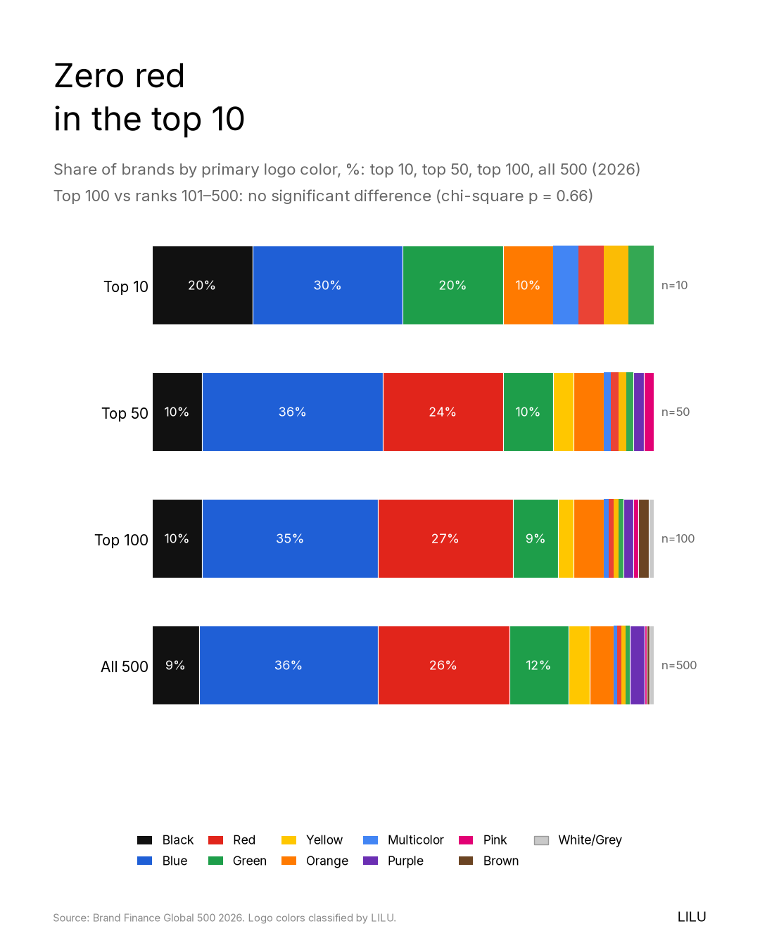
Blue is the color of 36% of the world's 500 most valuable brands, and if blue carried trust and trust carried value, those brands ought to be worth more than everybody else.
So we lined them up to find out, and the short version is that they are not, since the median blue brand in the top 100 is worth $38B and the statistics find no difference at all (p = 0.51). What follows is the long version.
I. What we looked at
Every year the valuation consultancy Brand Finance publishes the Global 500, a ranking of the world's most valuable brands. The 2026 edition puts Apple first at $607.6 billion, followed by Microsoft, Google, Amazon and NVIDIA. The public report gives dollar values only for the top 100, which together come to $6.39 trillion, and for ranks 101 to 500 it gives the position alone.
For each of the 500 brands we recorded a single primary logo color, drawn from blue, red, green, black, orange, yellow, purple, pink, brown and white/grey, plus a "multicolor" bucket for the logos that refuse to pick one. Then we asked 2 simple questions, which were which colors are most common, and whether any of them come with more value attached.
II. Blue wins the popularity contest
The margin is not close, and it is not close anywhere.
Across all 500 brands, 36% are blue (178 brands), 26% red (131), 12% green (59) and 9% black (47). Everything else, meaning orange, yellow, purple, pink, brown and grey, splits the remaining sixth between them.
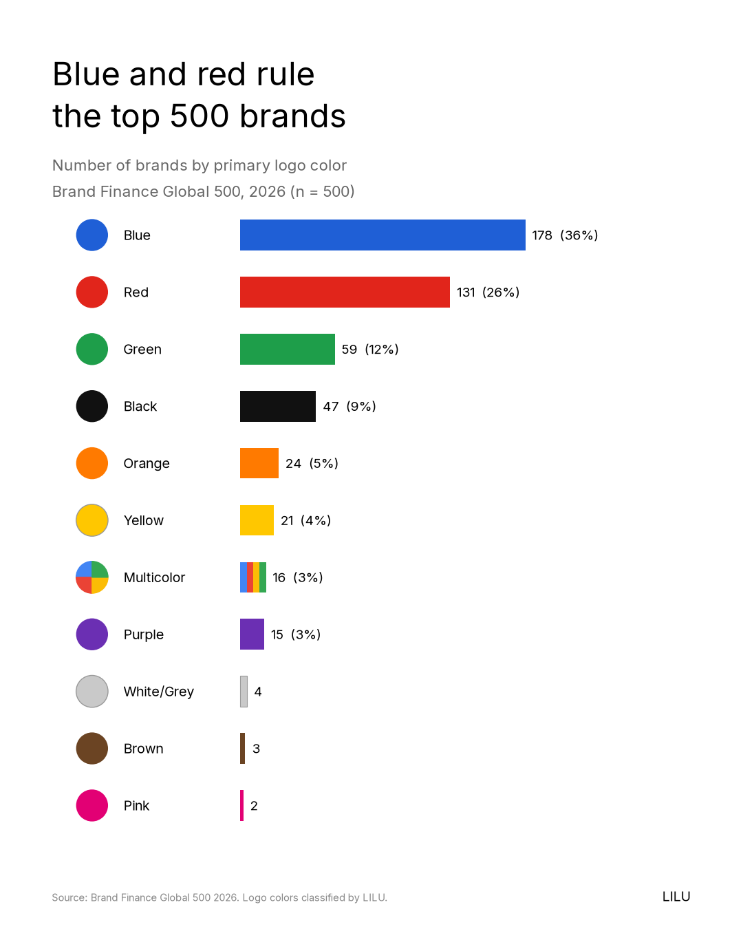
Blue gets more crowded still in the places where money is the product, since among the 111 banks and insurers in the ranking, 43% are blue. If you have ever had the feeling that every financial logo you pass is navy, you were very nearly right.
All of which looks like a recipe, right up until the moment you look at the money.
III. Blue wins nothing else
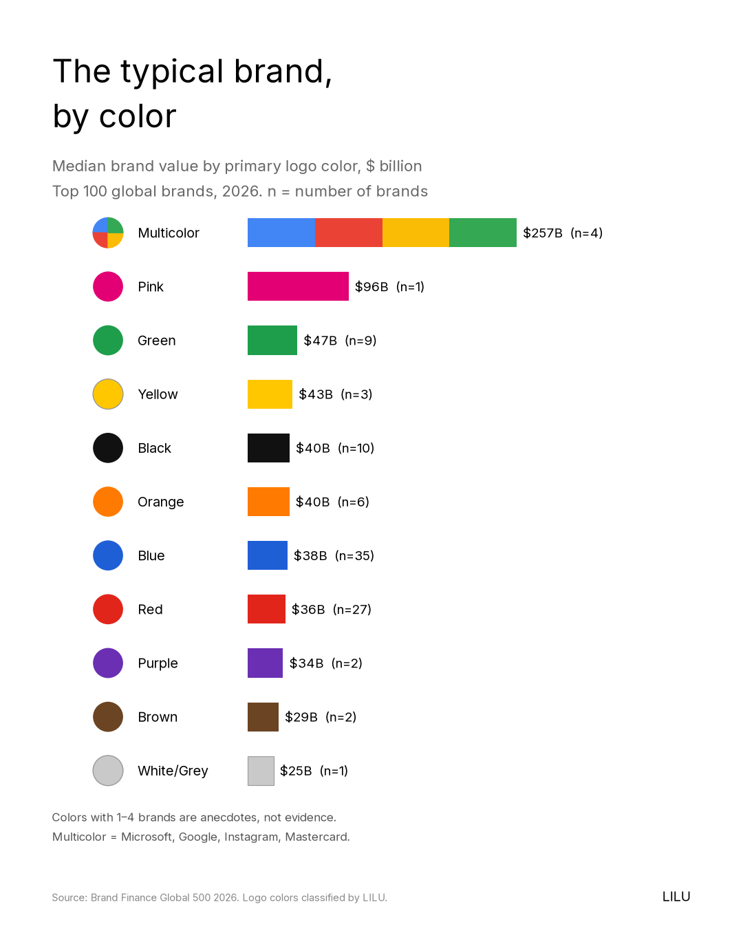
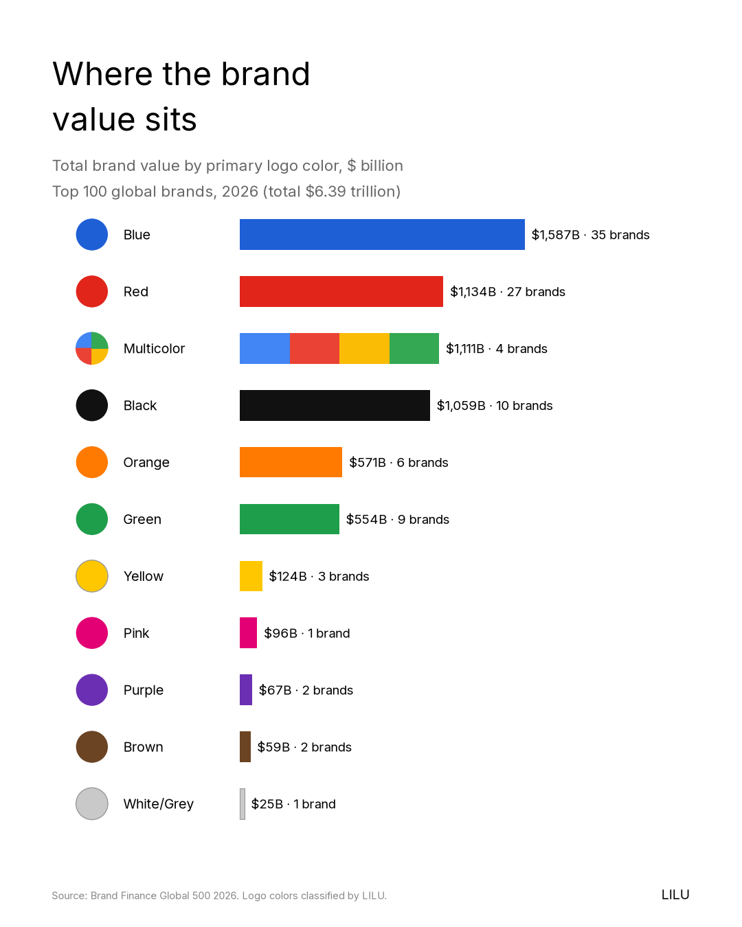
Within the top 100, where Brand Finance publishes values, the median brand in each color looks like this: green $47B (9 brands), black $40B (10 brands), blue $38B (35 brands) and red $36B (27 brands).
The most common color turns out to have one of the lowest medians, and the considerably rarer green has the highest. The single eye-catching number, multicolor at $257B, is an artifact of a very small group, because there are only 4 multicolor brands in the top 100 and 2 of them are Microsoft and Google, the other 2 being Instagram and Mastercard.
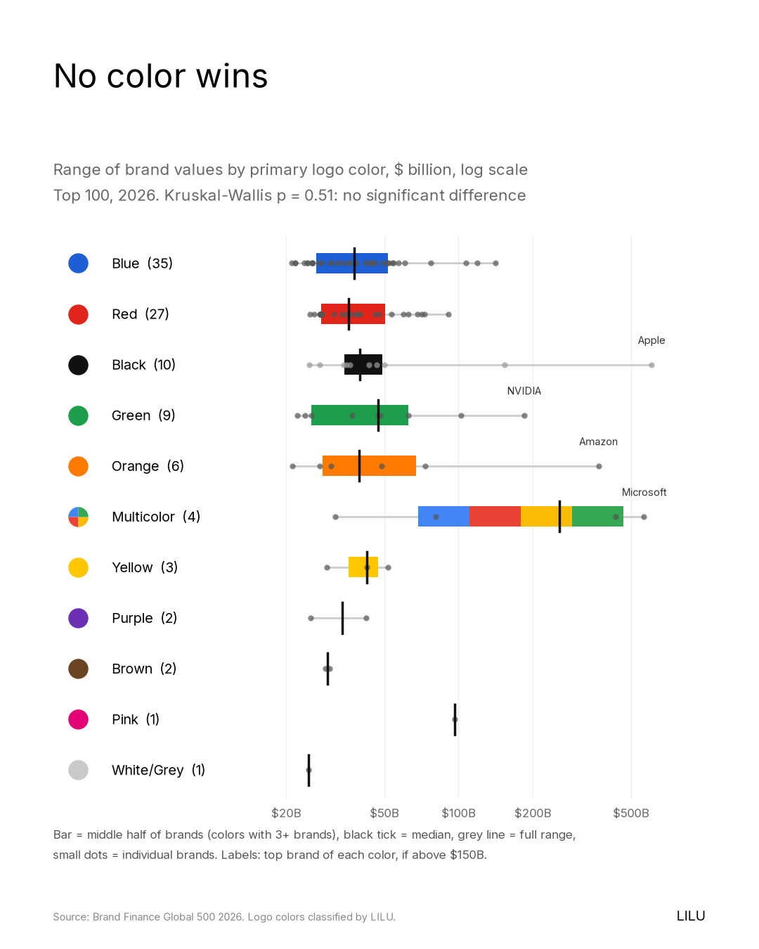
There is no red brand in the top 10 at all, which sounds like a finding until you notice that red still holds 27 of the top 100 places, and that the number-12 brand, ICBC, is a red bank worth $90.9 billion.
So we stopped eyeballing the numbers and ran the tests instead. A Kruskal-Wallis test, which asks whether several groups differ more than chance would explain, found no meaningful difference in brand value by color (p = 0.51) and none in rank across all 500 (p = 0.36). We also checked whether the elite top 100 has a different color mix from ranks 101 to 500, and it does not (p = 0.66). In plain English, if you shuffled the colors randomly between these brands, you would expect gaps at least this big most of the time.
The total-value chart tells the same story more vividly, since black holds 16.6% of top-100 value with only 10 brands, and it does so mostly because 1 of those brands is Apple. A single company can move an entire color, which tells you a great deal about which way the influence actually runs.
IV. Maybe the secret is multicolor?
That $257B median is tempting, because the 2 most valuable brands after Apple are multicolor and Apple itself wore a rainbow for 2 decades, so perhaps the secret is to use every color at once.
I checked, and the answer is no. There are 16 multicolor brands in the Global 500, of which 4 are in the top 100: Microsoft (#2, $565.3B), Google (#3, $433.1B), Instagram (#13, $80.8B) and Mastercard (#63, $31.5B). That is 4% of the top 100, against 12 of the 400 brands ranked 101 to 500 (3%), so there is almost no concentration at the top at all. The other 12 are perfectly ordinary company: TotalEnergies, Lidl, 7-Eleven, Enel, NBC, Coupang, Telstra, Sky, Domino's, Wipro, Swisscom and Southwest. The famous median is 2 giants in a sample of 4.
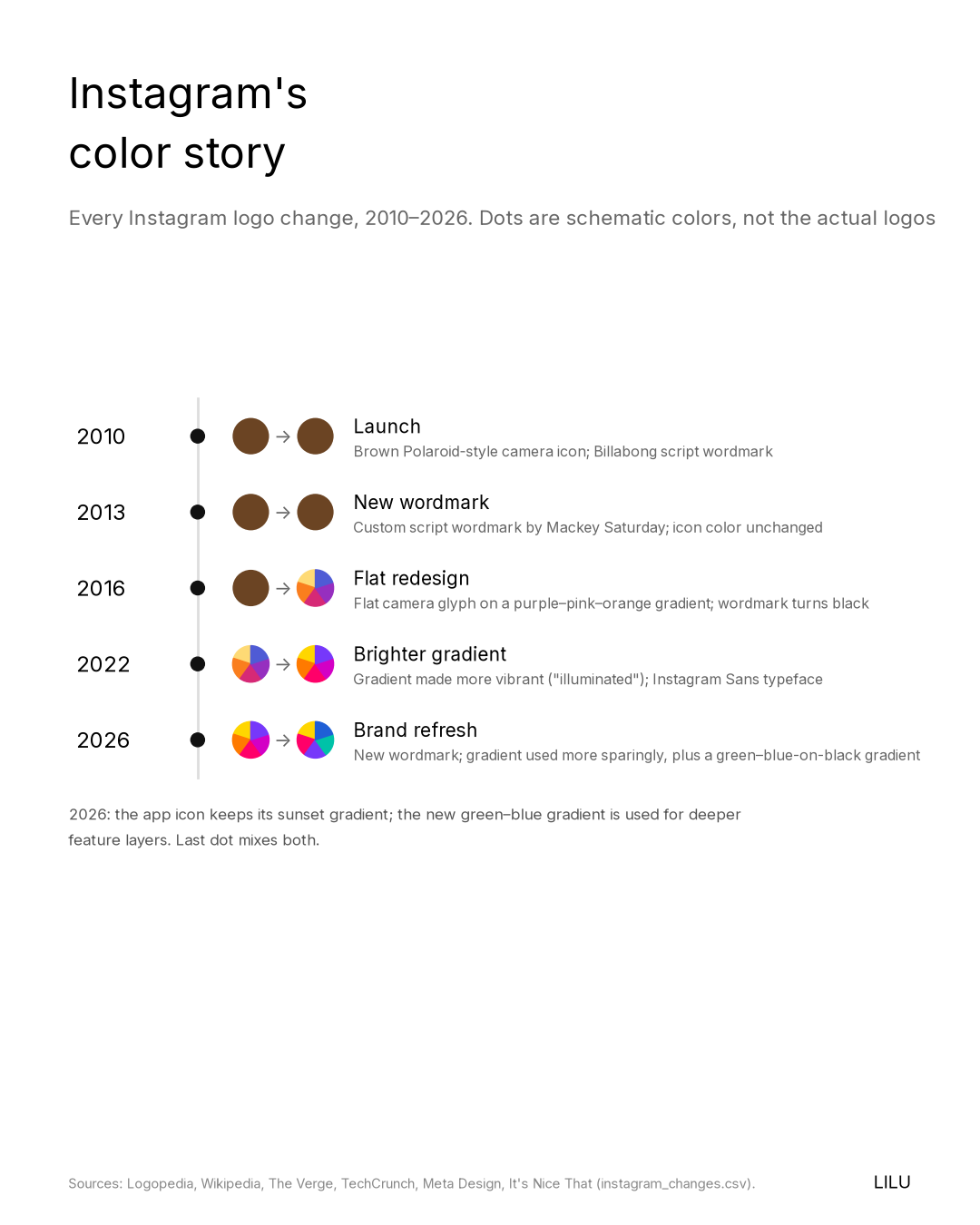
The timing tells the rest of it. Microsoft's corporate logo was a black wordmark until 2012, when it became the 4-color grid, long after Microsoft was already a giant. Google has been multicolor since its first logo, so its color and its success arrived together and cannot be pulled apart. Instagram launched with a brown camera icon and moved to its gradient in 2016, 4 years after Facebook bought it for about $1 billion (The New York Times). In each case the color came after the success, or alongside it, and never clearly before it.
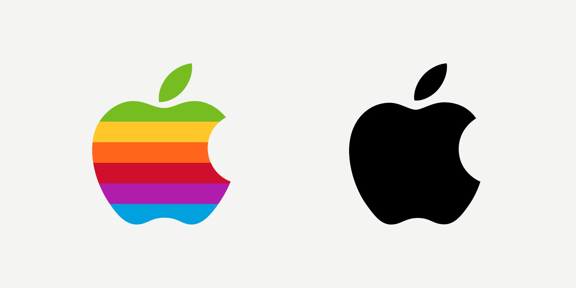
Apple is the counterexample, having carried the rainbow from 1977 to 1998. In the fiscal year ending September 1997 it lost $1.04 billion and was, in Steve Jobs's words, "90 days from being insolvent" (NBC News). Its long climb came after it went monochrome in 1998, though I would not credit black for that either, since Jobs's return, a much smaller product line, the iMac and later the iPod did the work.
My read is that multicolor is a palette rather than a strategy, and that it suits brands that are many things at once while being easiest to carry once you are already famous.
V. Popular is not the same as powerful
Look at any parking lot. Most of the cars in it are white, grey or black, and nobody has ever concluded from this that white, grey and black are the fast colors. They are the common colors, chosen for resale value and for convention and for the comfort of not standing out, while the speed comes from the engine.

Brand color works the same way, and "blue = trust" is a good example of a convention being mistaken for a cause, because how often a color appears is a map of industry conventions rather than a map of value. The data shows those conventions clearly enough. Banks lean blue. 7 of the 16 apparel brands and 8 of the 20 car brands are black. A third of the 68 Chinese brands in the ranking are red (34%), against a quarter (25%) of everyone else.
Value, meanwhile, comes from the business. Brand Finance does not measure how beautiful a logo is, since its "royalty relief" method estimates what a company would pay to license its own brand, which means applying a royalty rate to forecast revenues. Color simply is not an input to that sum, and revenue is.
The cleanest proof available is a single company. Apple launched its rainbow logo in 1977 and dropped it for a monochrome apple in 1998 (Logopedia), so the company that became the most valuable brand in the world did it under the plain mark, and yet nobody serious believes the rainbow was what held it back or that black was what pushed it forward. It was the same company wearing a different coat of paint, and what changed in between was the product.
VI. What color actually does
None of this means color does not matter. It means color matters for reasons quite different from the ones the "make us look valuable" brief assumes.
It helps people recognize you. A color held consistently for long enough becomes a shortcut to the whole brand, so that it can be read before the name is. That is a memory effect, and it builds slowly.
It signals your category. Banks are blue because blue reads as a bank, and following a convention tells people what you are in a fraction of a second, while breaking one tells them you are not like the others. Both are legitimate choices, for as long as they are deliberate ones.
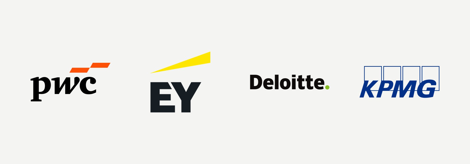
It sets you apart from the people you are actually competing with. The Big Four auditors are the best example I know of. They sell almost the same service to almost the same clients, and look at what they did with it. PwC went orange in 2010, EY went yellow in 2013, Deloitte settled on black with a green dot in 2016, and KPMG is blue (Logopedia; KPMG's color is our own coding). 4 firms in 1 category arrived at 4 colors, and all 4 of them sit in the Global 500: Deloitte at #42 ($43.5B), EY at #69 ($29.2B), PwC at #79 ($27.4B), KPMG at #125.
Color's job is to tell people which one you are, and it does not get a say in how much you are worth.
Color also carries personality, since the same study that tied blue to competence tied black to sophistication, which helps explain why so many brands launched since 2017 start out in black. But personality is not price, and the black brands in the top 100 have a median value of $40B, sitting right in the middle of the pack.
VII. If you are choosing a palette right now
Here is what I would take from all of this, as a founder who spends her days inside these conversations.
1. Map your category before you pick. Collect the logos of your 10 nearest competitors on a single page. If they are all blue, you now know what blue will say about you, and what it will cost you in distinctiveness.
2. Choose to be distinct, not to borrow prestige. No color makes you more valuable. Some colors make you more forgettable, because they make you look like everyone you happen to be standing next to.
3. Design it to work as a system. The color has to survive one-color printing, a 16-pixel favicon, dark mode and a sign across the street, and a palette that only works in the pitch deck is not working.
4. Commit to it. Recognition is earned through repetition, and in our companion history study, 43 of the 93 top brands we could trace have never changed their primary color.
5. Don't ask color to fix the business. If the product, the pricing or the story is not working, a new palette will make that very visible.
Back to the porch
So, back to the porch, and to the question that sent me down the rabbit hole in the first place, which was whether the color you choose has anything at all to do with how much money you make.
The honest answer is that the pull toward blue is real and very widely felt, and that it is also entirely circular. Blue reads as trustworthy because the institutions that earned our trust over a century happened to be blue, and every company that picks blue in order to borrow that feeling adds one more turn to the loop while receiving none of the trust, because the trust was never in the pigment. It was in a hundred years of those institutions mostly doing what they said they would do.
The world's most valuable brands are blue and red and green and black and orange and yellow, and the money is spread across all of them without much regard for which, so that what they have in common cannot be a hue. Each of them picked something, built a business that deserved the attention, and then kept showing up in the same color for long enough that the world eventually learned to recognize it.
Which leaves a choice that is smaller and more freeing than it first appears. The color is only ever how people find you, and whether finding you turns out to be worth their while is a question settled entirely by the business waiting at the other end of it.
Epilogue: honest caveats
Only the top 100 have public values. Our value comparisons cover 100 brands, so some color groups are tiny (2 purple brands, 1 pink). Ranks 101 to 500 enter only through rank.
Colors are our call. We assigned 1 primary color per brand from its current logo, which is approximate by nature. Of the 500 calls, 320 are high-confidence, 116 medium and 64 low-confidence, and logos with several colors had to be forced into a single bucket.
A null result is not proof of zero. The tests say we cannot detect a relationship. A very small effect could hide in a sample this size, though a large one would have shown up.
This is a snapshot of winners. We see only brands that made the list, and nothing in this data tells us whether color helps anyone get onto it.
Correlation runs both ways. Where a color looks rich, it is usually because 1 rich company wears it.
Method note. Brand list, ranks, sectors, countries and 2026 values for ranks 1 to 100 come from the Brand Finance Global 500 2026 report. Primary colors were coded by hand from current logos. Tests were Kruskal-Wallis on value (top 100, colors with at least 3 brands) and on rank (all 500, colors with at least 5 brands), plus a chi-square test comparing the color mix of the top 100 with ranks 101 to 500. Logo history comes from Logopedia, a fan-maintained wiki, cross-checked with Wikipedia where possible.
Sources
Brand Finance, Global 500 2026 (preview report). Logopedia (fan wiki) entries for Apple, PricewaterhouseCoopers, EY, Deloitte, Microsoft, Google, Instagram and IBM. Labrecque, L. I. & Milne, G. R. (2012), Exciting red and competent blue, Journal of the Academy of Marketing Science 40, 711–727. Cheskin, L. (1951), Color for Profit. Eysenck, H. J. (1941), A Critical and Experimental Study of Colour Preferences, American Journal of Psychology 54(3). Jacobs, L., Keown, C., Worthley, R. & Ghymn, K.-I. (1991), Cross-cultural Colour Comparisons: Global Marketers Beware!, International Marketing Review 8(3).
Hallock, J. (2003), Colour Assignment, University of Washington. YouGov (2015), Why is blue the world's favorite color? Cool Infographics (2013), The Color Emotion Guide, attributed to The Logo Company. The Logo Company (2023), The importance of the Color Blue. Singh, S. (2006), Impact of color on marketing, Management Decision 44(6). MarketSplash, color psychology statistics source check. Cyr, D., Head, M. & Larios, H. (2010), Colour appeal in website design within and across cultures, International Journal of Human-Computer Studies 68(1–2).
Aslam, M. M. (2006), Are You Selling the Right Colour?, Journal of Marketing Communications 12(1). Elliot, A. J. & Maier, M. A. (2014), Color Psychology, Annual Review of Psychology 65, 95–120. The New York Times DealBook, Facebook Buys Instagram for $1 Billion (April 9, 2012). NBC News, How Steve Jobs Saved Apple. LILU analysis of the Brand Finance Global 500 2026 logo colors.
LILU is a branding, design and web development studio in New York City. We spend a lot of time helping founders decide what their brand should look like and why. If this is the conversation you're having right now, we're always glad to have it.
Start a conversation